Targe - The Modern Workspace
A focused project management SaaS for makers, founders, and product teams, designed and built with my developer co-founder.
As co-founder and product designer, I led the product experience from research through hi-fi UI and built the frontend in React, working alongside my developer co-founder who led backend engineering. Now live in public beta at targe.app.
Project tools create work about work
Most project management platforms weren't built for the people actually doing the work. They're designed for enterprise rollouts with heavy setup, bloated feature sets, and interfaces that pull attention away from shipping.
I kept seeing the same pattern with founders, freelancers, and small product teams: they'd adopt a tool, spend days configuring it, then revert to spreadsheets or scattered notes because the overhead wasn't worth it. The tool became another job.
We co-founded Targe to answer a simple question: what if a workspace helped you focus on delivery instead of managing the manager?
- High setup overhead before any real work begins
- Cluttered UIs that bury tasks under navigation and chrome
- Tools built for admin reporting, not daily maker workflows
- No clear view of what's moving vs. what's stuck across projects
Co-founding Targe and leading product design
I co-founded Targe with a developer co-founder. I led product design end to end: problem framing, UX strategy, visual design, prototyping, and frontend implementation. My co-founder led backend engineering and technical architecture.
We worked as a tight two-person founding team with short feedback loops between design and engineering. I could test an interaction in Figma, validate the flow, then ship it in React while my co-founder built the systems behind it.
- Product & UX (my focus)
- Problem discovery, user flows, IA, wireframes, hi-fi UI, prototyping
- Frontend (my focus)
- React, TailwindCSS, responsive layouts, component structure
- Engineering (co-founder)
- Backend architecture, APIs, infrastructure, technical delivery
- Shared
- Positioning, beta feedback loops, onboarding refinements, feature prioritisation
Three audiences, one need: clarity without clutter
Rather than building a generic PM tool, I defined three primary user types with overlapping but distinct jobs-to-be-done:
Makers
Solo builders, freelancers, and side-project creators who need a lightweight space to track work without enterprise overhead. They optimise for speed and focus.
Founders
Early-stage leaders running multiple initiatives who need visibility across projects without living inside a complex dashboard. They optimise for clarity and control.
Product teams
Small teams running sprints and releases who need shared context, task ownership, and progress tracking without the ceremony of heavyweight agile tooling.
Design for focus, ship in focused iterations
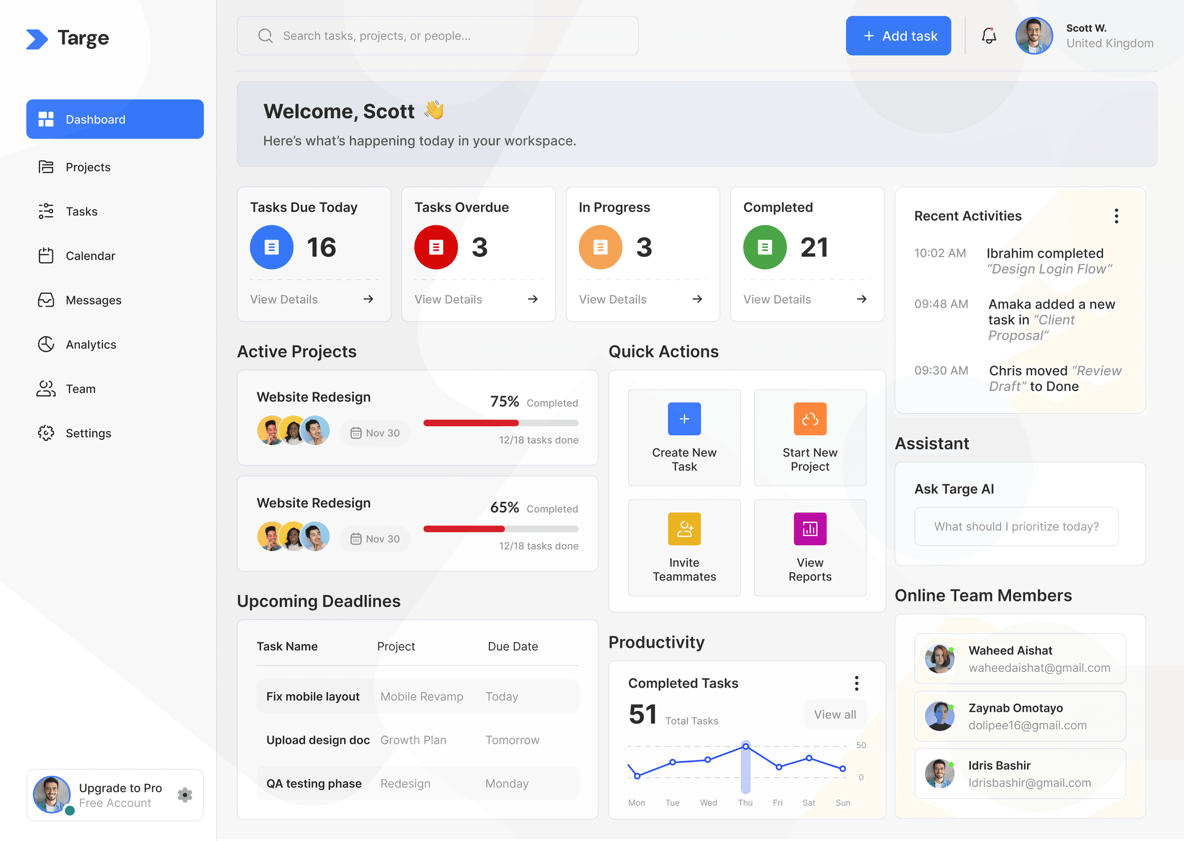
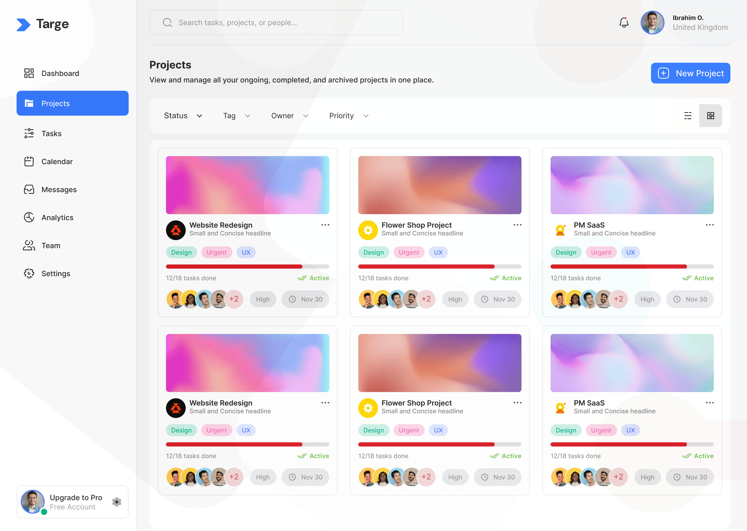
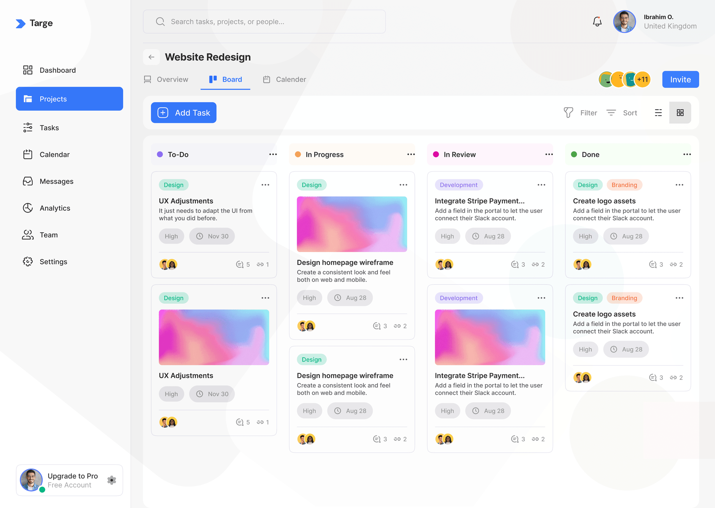
I structured the product around three core workflows that map to how people actually work: set up a workspace, manage tasks across projects, and track progress toward delivery. Every design decision was evaluated against a single filter: does this help the user ship, or does it add management overhead?
Workspace-first architecture
Users start by creating projects and inviting collaborators, not by configuring boards, automations, or integrations. Onboarding is measured in minutes, not days.
One view for action
A unified task view surfaces priorities across projects so users don't context-switch between boards, lists, and reports to understand what's due.
Progress without performance theatre
Sprint and completion views show meaningful progress (done, active, remaining) without turning the product into a reporting dashboard for managers who aren't in the tool daily.
Progressive complexity
Advanced capabilities like filters, analytics, and collaboration are available when needed but never block the first session. The default experience stays calm.
What we built, and deliberately left out
No enterprise setup tax
Users can create a workspace and add tasks in their first session. I removed mandatory configuration steps that plague traditional PM tools.
Why: Early beta feedback showed drop-off correlated with setup length. Reducing time-to-first-task became a core metric.
Task clarity over feature breadth
I prioritised assign, prioritise, track, and complete over integrations, automations, and admin tooling for v1.
Why: Founders and small teams told me they wanted a tool that works immediately, not one they need to hire someone to configure.
Design system baked into code
Visual patterns, spacing, and components were defined once and implemented directly in the frontend, with no separate design-dev translation layer.
Why: As a small founding team, consistency had to be automatic. A shared component approach kept the UI cohesive as the product grew.
Beta-first launch
Shipped early access with a focused landing page and waitlist rather than waiting for a feature-complete v1.
Why: Real usage data and sign-up momentum matter more than a perfect feature matrix. Beta let us validate positioning before scaling backend infrastructure.
From Figma flows to production UI
Targe is where my product design and frontend skills converge. I designed the interaction model and visual language in Figma, then implemented the desktop experience in React with TailwindCSS. My co-founder built the backend that powers workspaces, tasks, and collaboration behind the scenes.
Key surfaces include the marketing site, early-access funnel, workspace setup, cross-project task management, sprint progress views, and collaboration touchpoints. Each was designed as a reusable component, not a one-off screen.
- Responsive marketing site with clear conversion path to early access
- Component-based frontend architecture for scalable UI iteration
- Landing page copy and structure tested against user type segments
- Performance-conscious layouts with fast load and minimal visual noise
Live product, early traction, clear next steps
Targe is live at targe.app and accepting early access applications. The product has moved from concept to a functioning beta with real users managing real work.
Early signals validate the core thesis: teams want a calmer, faster alternative to bloated project tools. Onboarding stays under two hours on average, and beta users have already managed 10,000+ tasks on the platform.
What's next: completing remaining frontend flows, deepening backend integration, and moving toward a closed beta before MVP 1 launch. The design foundation and frontend architecture are in place. The focus now is hardening flows and preparing for scale as a team.