Ruth Miskin Training - Online Assessment Portal
Redesigning a national ed-tech assessment platform used by 60% of UK schools, for learners, teachers, and assessors.
As Product Designer, I led the UX redesign of Ruth Miskin Training's Online Assessment Portal, modernising complex assessment workflows for schools nationwide while collaborating closely with engineering and product management.
A product schools depended on, but didn't enjoy using
Ruth Miskin Training's Online Assessment Portal is a core product used by around 60% of UK schools to assess children's reading progress. Functionally, it worked. But after years of engineering-led development, the experience had fallen behind competitors on usability, visual clarity, and brand cohesion.
The team was heavily developer-focused, which meant features shipped reliably but the interface accumulated friction: outdated styling, inconsistent patterns, and workflows that made everyday tasks harder than they needed to be for teachers and assessors managing hundreds of pupils.
The business needed a redesign that respected what already worked technically, while making the product something schools actually wanted to open every day.
- Years of functionality-first development had outpaced the visual and UX layer
- Teachers and assessors navigated complex flows to manage classes, pupils, and live assessments
- Outdated colour and styling undermined trust compared to modern ed-tech competitors
- Three distinct user types (learners, teachers, assessors) each needed clearer, faster paths
End-to-end product design inside a cross-functional team
I joined Ruth Miskin Training as Product Designer for a focused engagement, working within a cross-functional team of engineers and product managers. I owned the UX redesign from early wireframes through lo-fi and hi-fi prototypes, translating school-facing requirements into interfaces the engineering team could build against.
Beyond the assessment portal, I also redesigned and optimised parts of the company website, improving brand identity, usability, and overall user experience where legacy styling had become dated.
- Discovery & UX
- User flow mapping, wireframes, lo-fi and hi-fi prototypes in Figma
- Collaboration
- Daily alignment with engineering and product management on scope and feasibility
- Assessment flows
- Class management, live assessment, pupil results, and profile editing
- Brand & web
- Website refresh for improved identity and usability
Three audiences, one national platform
The portal serves the full school assessment ecosystem. Each group interacts with the same product but with very different goals, so the redesign had to clarify roles without fragmenting the experience.
Teachers
Manage classes, year groups, and pupil lists. Need fast ways to add pupils, track assessment status across groups, and understand who still needs to be assessed.
Assessors
Run live reading assessments in the classroom. Need a focused, low-friction interface with clear progress tracking, keyboard shortcuts, and minimal distraction during sessions with children.
Learners
Children being assessed need calm, readable interfaces. Results and progress views must be clear for adults interpreting outcomes on their behalf, with phonics-level detail surfaced simply.
Modernise the experience without breaking what schools rely on
I started by mapping the existing assessment journey end to end: sign-in, class setup, pupil management, live assessment, results review, and profile updates. Rather than proposing a ground-up rebuild, I identified where visual hierarchy, spacing, and interaction patterns could remove friction within the current product architecture.
Prototypes moved from wireframes to lo-fi flows for team review, then to hi-fi screens aligned with an updated teal and yellow brand language that felt contemporary without alienating existing users.
Workflow-first, not pixel-first
Each screen was tied to a real school task: adding a class group, filtering pupils by assessment status, running a live session, or reviewing phonics results. Design decisions were validated against these jobs, not abstract UI patterns.
Built for cross-functional delivery
With a developer-heavy team, prototypes needed to be unambiguous. I structured Figma files and specs so engineering could map components directly, reducing back-and-forth during implementation.
Consistent system across the portal
Navigation, tables, tabs, modals, and action buttons were unified across classes, assessments, and pupil profiles so users learned the interface once and applied it everywhere.
Balancing modern design with a live, national product
Refresh the brand layer, not the data model
I updated colour, typography, spacing, and component styling across the portal while keeping underlying structures familiar to returning users.
Why: Schools needed a product that felt new, not one that forced them to relearn every workflow from scratch.
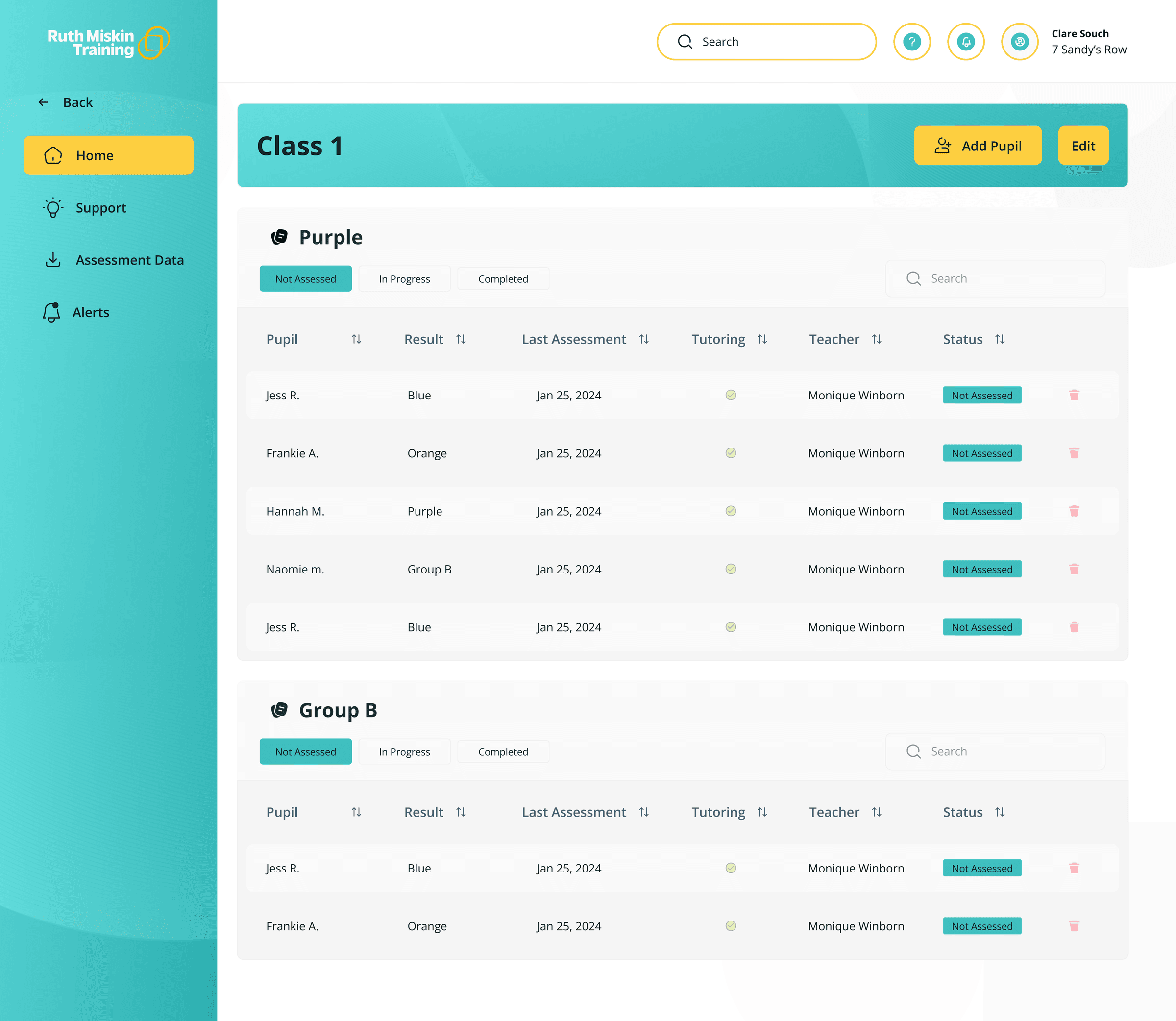
Status-driven pupil tables
Class views use tabbed filters (Not Assessed, In Progress, Completed) so teachers immediately see who needs attention.
Why: The most common teacher question is 'who still needs assessing?' That should be answerable in one glance.
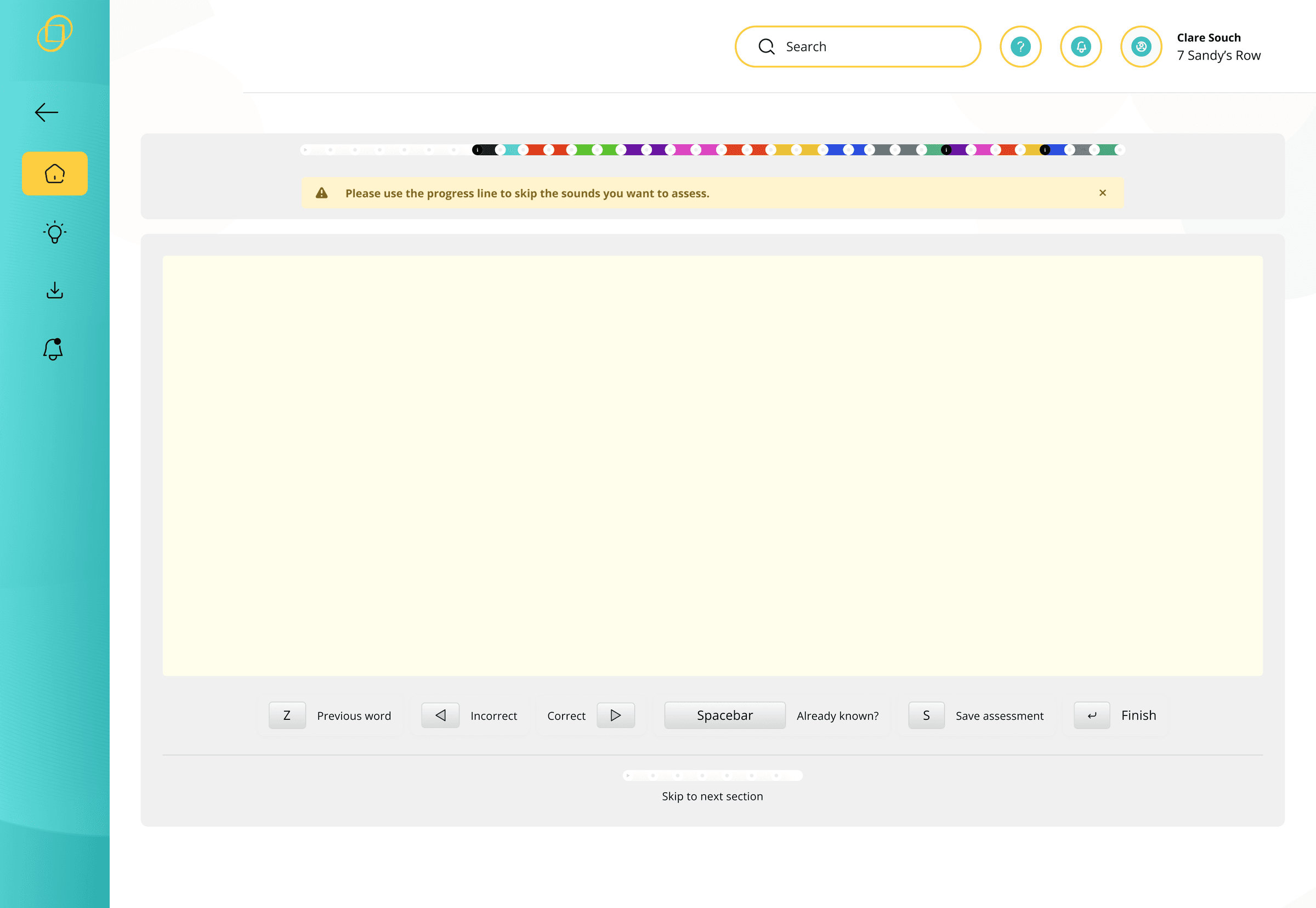
Focused live assessment mode
The assessment screen strips away navigation noise and centres the assessor on progress tracking, word display, and keyboard-driven controls.
Why: Assessors work under time pressure with children present. Every extra click breaks focus.
Granular pupil profiles with editable context
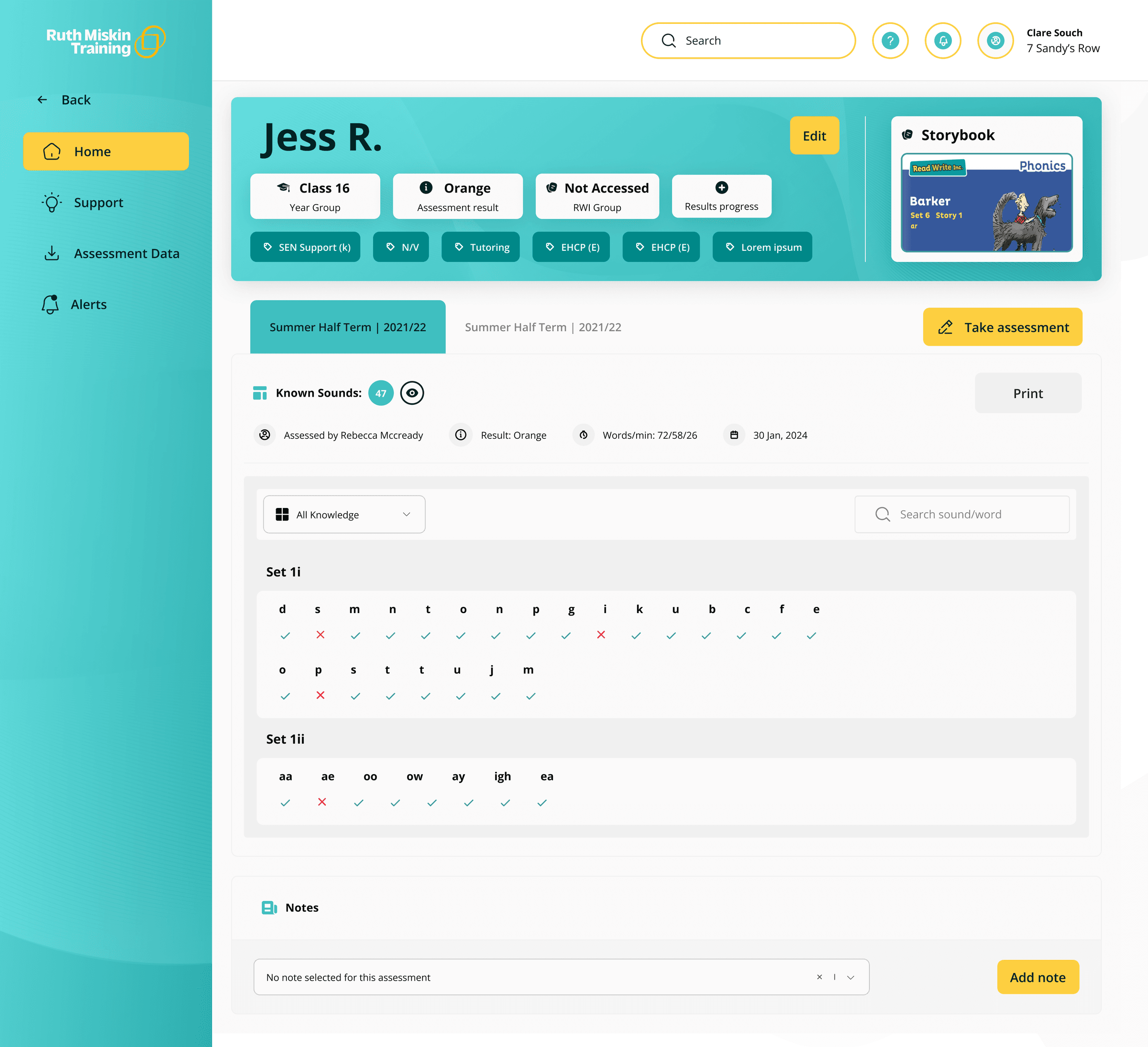
Individual result pages surface phonics-level detail, storybook links, and SEN/tutoring flags, with profile edits handled in a clear modal pattern.
Why: Teachers need depth on individual children without losing the thread of class-level management.
A redesign schools were excited to use
The redesigned Online Assessment Portal shipped with an updated look and significantly improved usability across class management, live assessment, and pupil results. The product retained the reliability schools depended on, while closing the gap between functionality and experience.
Feedback from schools after launch validated the approach: the new interface made the product feel current, approachable, and easier to work with day to day.
- Full assessment flow redesigned for teachers, assessors, and learners
- Modernised brand and UI across portal and parts of the company website
- Positive reception from schools after launch
- Delivered in close collaboration with engineering and product management
“Schools loved the new update and are very much excited to use the product now based on the new look.”