Zafunda - Learning Platform
A product design concept for a playful, age-banded e-learning platform that helps children aged 3 to 12 learn at their own pace.
An ed-tech UX exploration: designing a cross-platform learning experience from parent-facing marketing through mobile onboarding, age-appropriate activity hubs, and gamified lesson rewards.
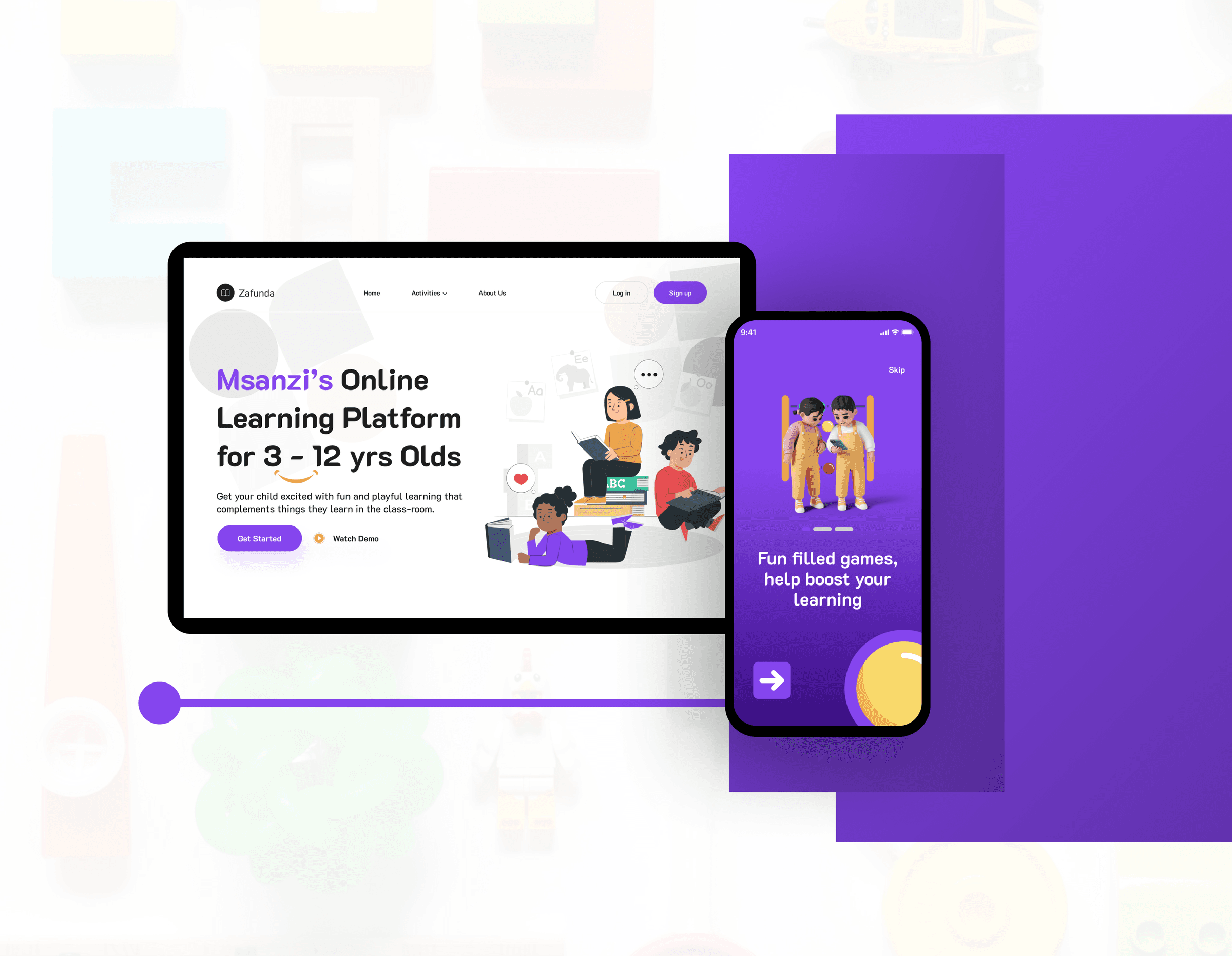
Learning platforms that feel like homework, not play
Children's e-learning products often copy adult SaaS patterns: dense dashboards, formal language, and navigation that assumes adult patience. Parents want something that complements classroom learning without feeling like another chore for their child.
Zafunda started as a concept exploration to answer: how do you design a learning platform that feels playful for kids aged 3 to 12 while still giving parents confidence that content is structured and age-appropriate?
Note: This is a personal product design concept, not a shipped client product. It demonstrates UX thinking, visual craft, and end-to-end design execution in ed-tech.
- One-size-fits-all interfaces that ignore developmental age ranges
- Onboarding flows that feel corporate instead of welcoming
- Gamification bolted on without tying rewards to learning progress
- Marketing and app experiences that feel like different products
End-to-end product design exploration
I owned this concept from problem framing through visual design: user flows, wireframes, hi-fi web and mobile UI, illustration direction, and a Behance case study documenting the full exploration. The goal was to practice ed-tech product thinking at a level comparable to real client work.
- UX & flows
- Parent signup, child onboarding, age-banded activity hubs, lesson completion
- Visual design
- Marketing site, mobile app UI, 3D illustration system, purple brand language
- Prototyping
- Hi-fi Figma screens and animated showcase
- Deliverable
- Behance case study documenting the full concept
Designed for parents and children at different stages
The concept serves two audiences: parents who discover, sign up, and monitor progress, and children who need interfaces matched to their reading level, attention span, and developmental stage.
Parents of young learners
Adults evaluating an e-learning product who need clear value messaging on the web and a trustworthy signup path before handing a device to their child.
Children aged 3 to 5
Toddlers who need large touch targets, simple language, and visual cues instead of dense text navigation.
Children aged 6 to 12
Preschool and scholar-age learners who can handle more structured activity cards, recommendations, and light gamification like coins and lesson rewards.
Age-banded learning with a playful but structured system
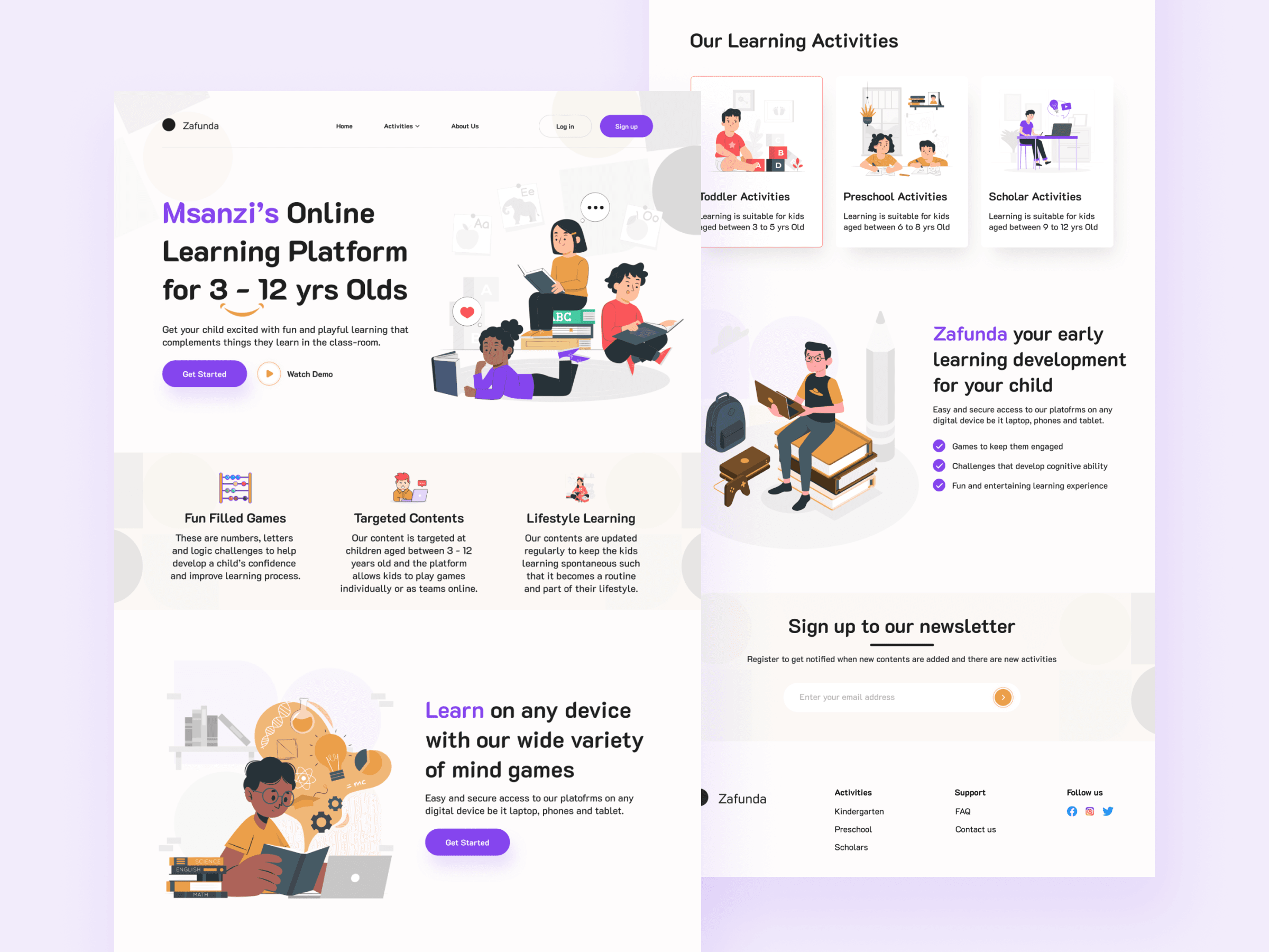
I structured the concept around three experience layers: a parent-facing marketing site that explains the platform, a mobile onboarding path that welcomes children warmly, and an activities hub that groups content by developmental stage.
Visual language uses confident purple as the primary brand colour, warm yellow accents, rounded cards, and 3D character illustrations so the product feels friendly without sacrificing clarity.
Marketing that speaks to parents
The landing page leads with who the platform is for, what children gain, and clear calls to action for signup and demo content.
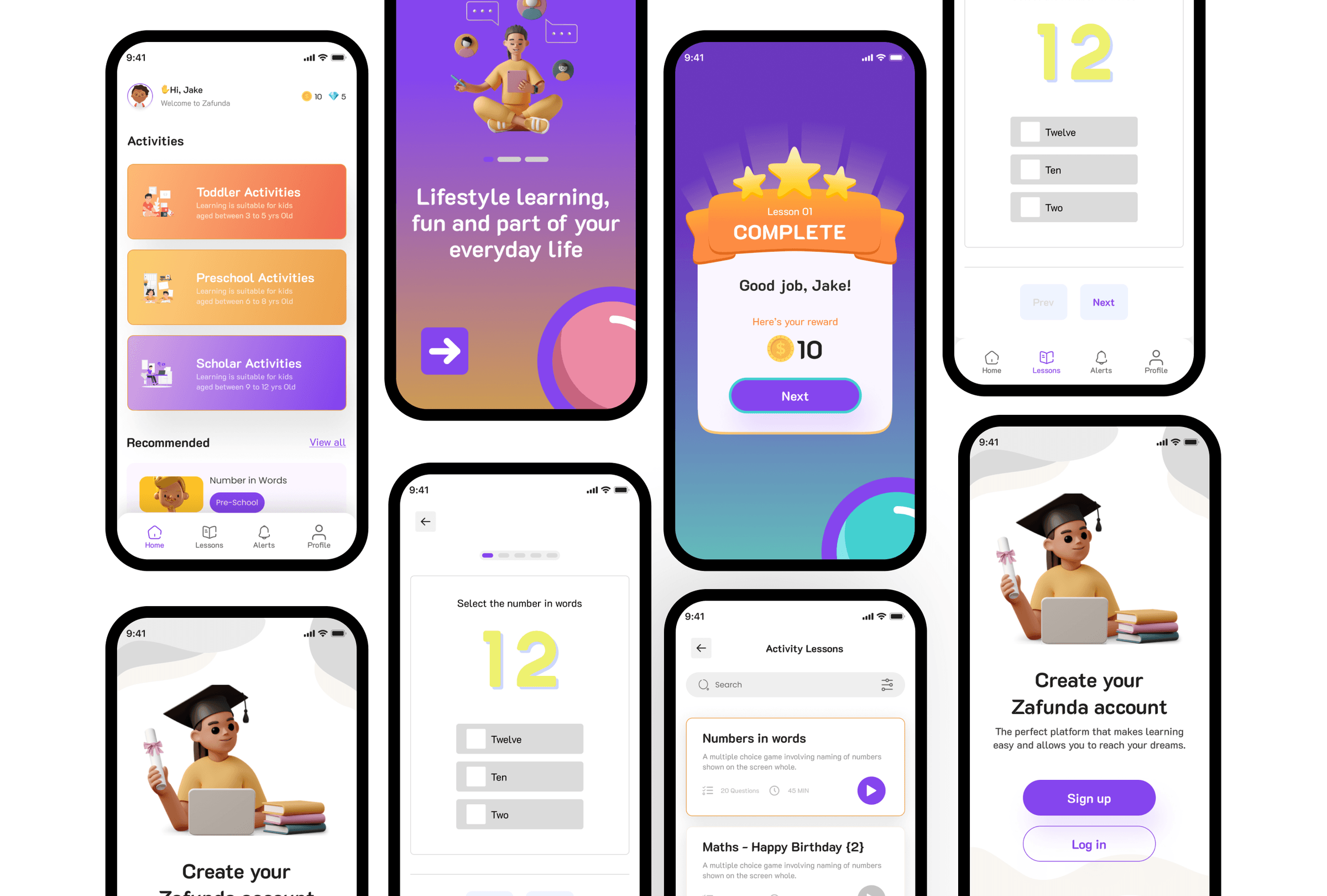
Onboarding that welcomes kids
Mobile onboarding uses illustrated characters, short copy, and step indicators so new users understand progress without reading long instructions.
Activities grouped by age band
Toddler, preschool, and scholar activity cards each use distinct colour gradients and age-range labels so content feels intentional, not generic.
Design choices that shaped the concept
Age-banded activity cards
The home screen groups learning into Toddler, Preschool, and Scholar bands with distinct colours and age ranges on each card.
Why: A 4-year-old and a 10-year-old need different content density. Surfacing age bands upfront helps parents and children self-select quickly.
Gamification tied to lesson completion
Coins and reward modals appear after completing a lesson, not as arbitrary pop-ups on the home screen.
Why: Rewards should reinforce progress. Tying them to completion keeps gamification purposeful rather than distracting.
3D illustration system
Character illustrations use a consistent 3D clay style across onboarding, success states, and feature highlights.
Why: Children respond to characters and celebration moments. A unified illustration style makes the product feel cohesive and premium.
Purple-forward brand identity
Purple anchors the logo, primary buttons, and key app surfaces, with yellow as a secondary accent for energy and contrast.
Why: Ed-tech products often default to safe blues. A distinctive purple palette helps Zafunda feel memorable while staying approachable.
What this concept demonstrates
Zafunda is a portfolio exploration, not a live product. It demonstrates my ability to think through ed-tech UX problems, design for multiple age groups, and present a complete cross-platform concept with consistent brand and illustration direction.
The full visual case study with additional screens is published on Behance. If this were taken to production, I would validate flows with parent interviews on signup comprehension, child task success by age band, and retention after the first completed lesson.
- Cross-platform concept from marketing site to mobile app
- Age-banded content model for children 3 to 12
- Cohesive illustration and gamification system
- Documented as a public Behance case study