Finto - Digital Banking
A product design concept for a mobile-first digital banking experience focused on clarity, trust, and everyday money management.
An exploration in fintech UX: designing a digital banking concept from brand and marketing surfaces through mobile wallet, currency tools, and identity verification flows.
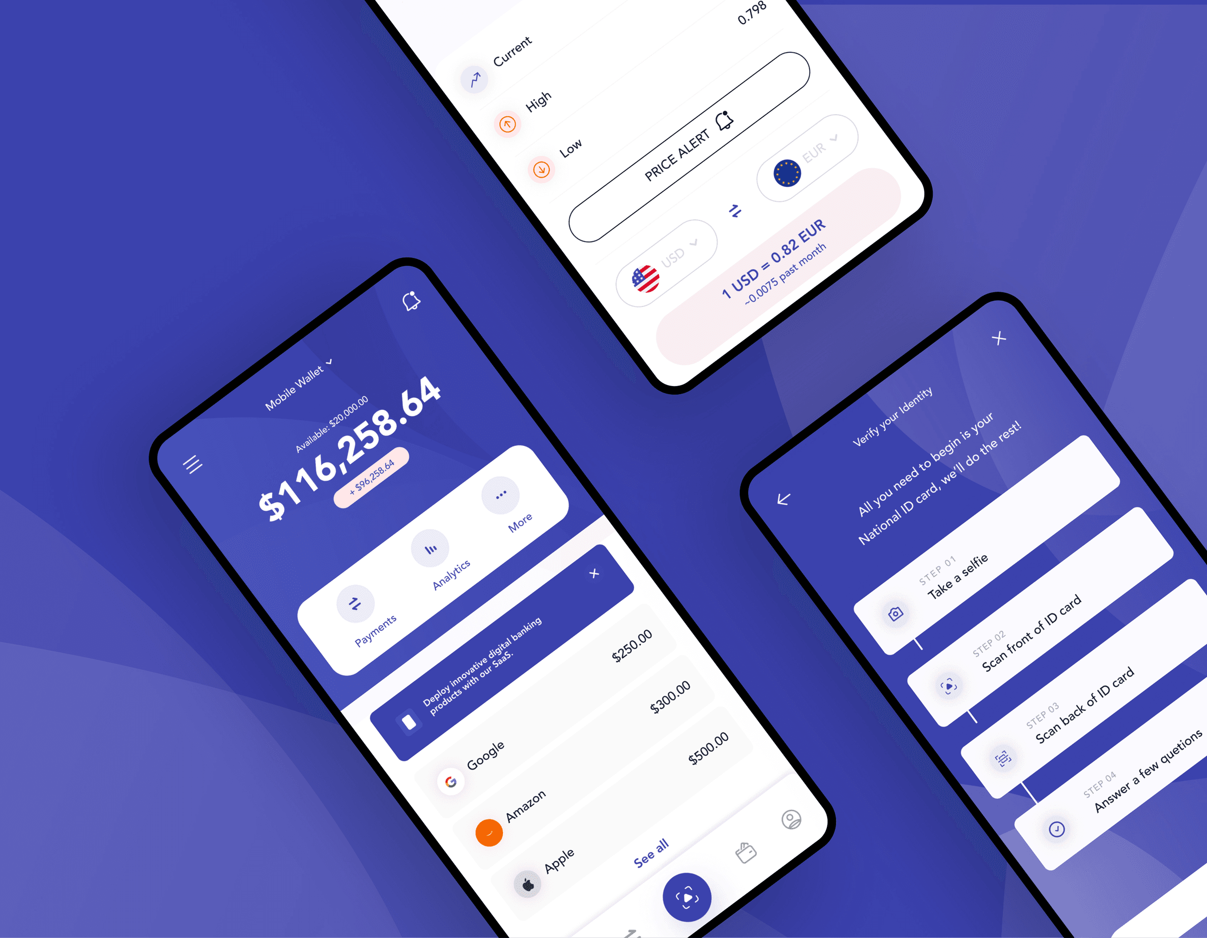
Digital banking that feels powerful but not approachable
Most digital banking apps either feel corporate and cold, or try so hard to look modern that they sacrifice clarity. Users opening a banking app usually have a simple goal: check their balance, move money, or complete a quick task without friction.
Finto started as a concept exploration to answer: what would a digital banking product look like if it felt confident, calm, and easy to trust on mobile?
Note: This is a personal product design concept, not a shipped client product. It demonstrates UX thinking, visual craft, and end-to-end design execution in fintech.
- Busy interfaces that bury primary account information
- Onboarding and verification flows that feel intimidating
- Inconsistent brand experience between marketing site and mobile app
- Currency and account tools treated as afterthoughts
End-to-end product design exploration
I owned this concept from problem framing through visual design: user flows, wireframes, hi-fi mobile UI, marketing page layouts, and brand touches including card and logo explorations. The goal was to practice fintech product thinking at a level comparable to real client work.
- UX & flows
- Wallet dashboard, currency exchange, identity verification, marketing journeys
- Visual design
- Mobile UI, landing page, debit card concepts, colour and type system
- Prototyping
- Hi-fi Figma screens and interactive presentation
- Deliverable
- Behance case study documenting the full concept
Designed for everyday mobile banking moments
The concept targets users who manage money primarily on their phone: checking balances, reviewing transactions, converting currency, and completing verification when opening or upgrading an account.
Everyday account holders
People who want a clear snapshot of available funds, recent activity, and quick access to payments without navigating complex menus.
New digital banking users
Users going through identity verification who need a step-by-step flow that feels guided, not bureaucratic.
Cross-border users
People tracking exchange rates and converting between currencies who need rates and alerts presented simply.
Mobile-first clarity with a cohesive brand layer
I structured the concept around three experience pillars: a calm wallet home screen, focused utility flows (currency, verification), and a marketing layer that communicates trust and modern infrastructure.
Visual language uses deep blues, soft gradients, and high-contrast cards so financial data stays legible while the product still feels contemporary.
Wallet as home base
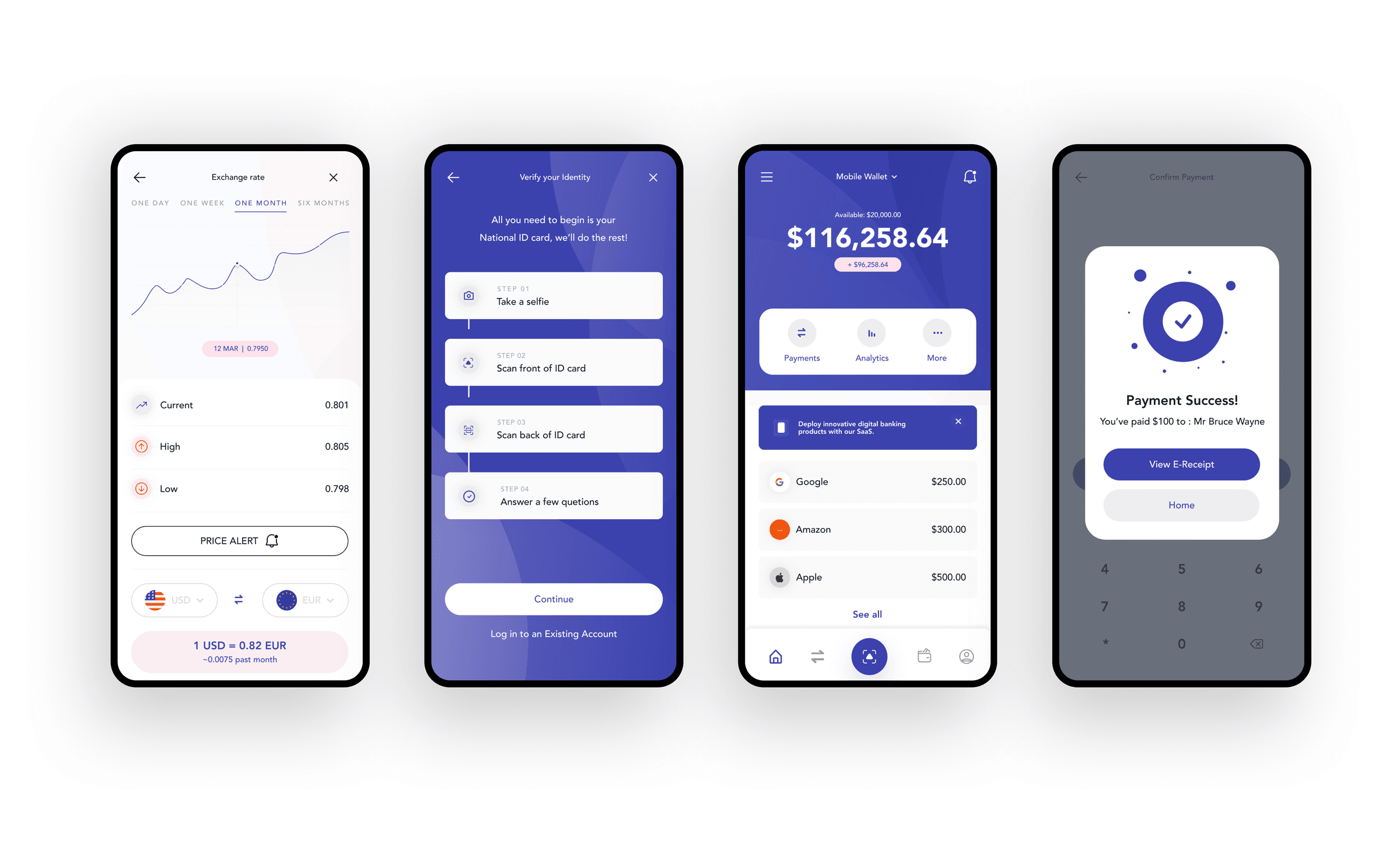
The dashboard leads with available balance and recent transactions, with quick actions for payments, analytics, and more kept one tap away.
Guided verification
Identity verification breaks into four clear steps with plain language, reducing anxiety during onboarding.
Marketing that matches the product
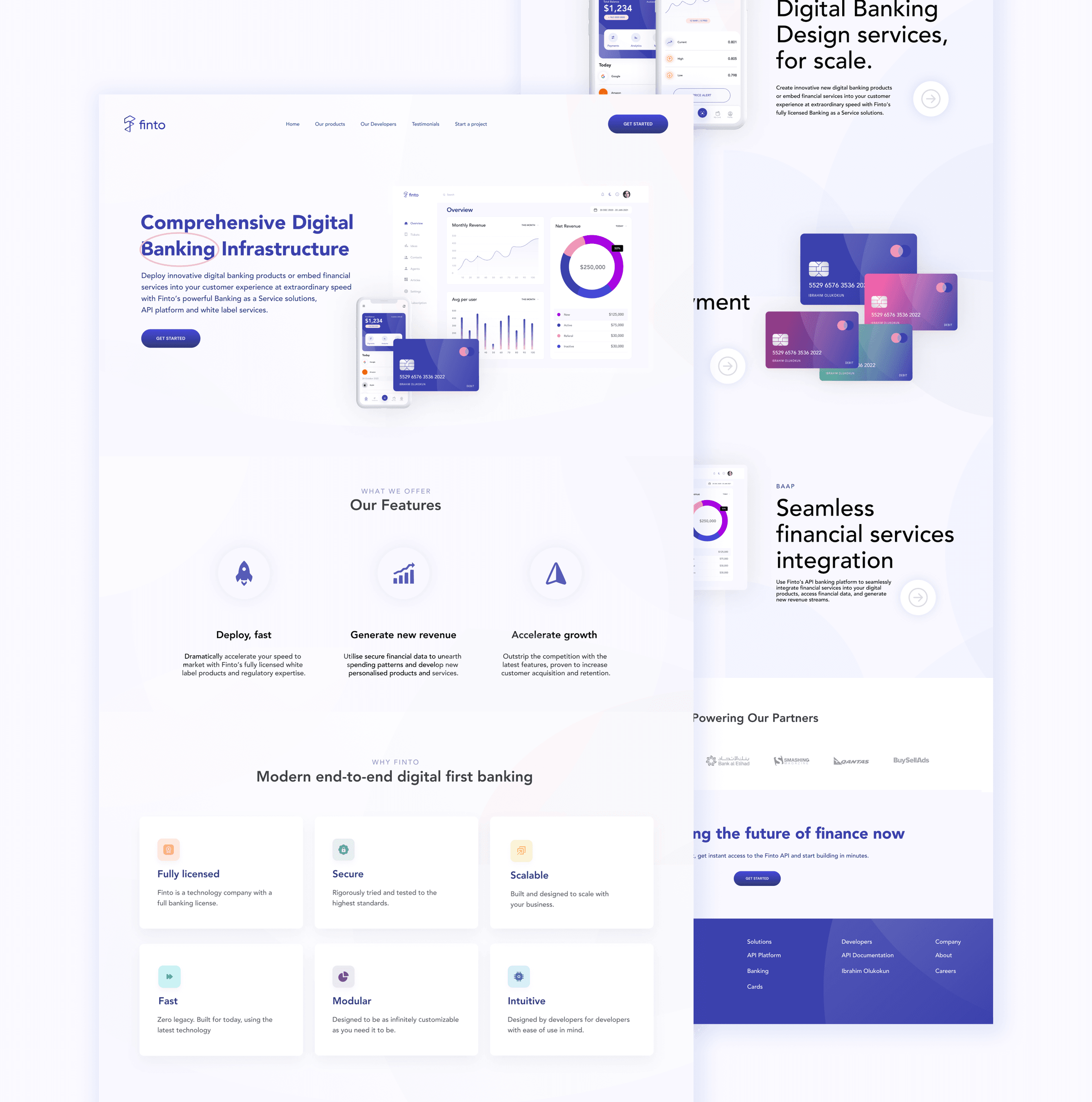
The landing page mirrors the app's tone: infrastructure-grade credibility with approachable copy and feature cards for security, scale, and modularity.
Design choices that shaped the concept
Balance-first hierarchy
The home screen leads with total balance and available funds before secondary features or promotions.
Why: Most sessions start with 'how much do I have?' That answer should be immediate.
Step-based verification
KYC is broken into selfie, ID scans, and short questions as discrete cards in a vertical flow.
Why: Chunking complex compliance into steps reduces drop-off and user anxiety.
Unified blue brand system
Marketing pages, app UI, and card designs share the same blue gradient family and rounded card patterns.
Why: Fintech trust is partly visual. Consistency signals a single product, not disconnected screens.
Currency tools as a dedicated surface
Exchange rates and price alerts get their own focused view rather than buried in settings.
Why: Users checking FX rates want a fast, glanceable screen without navigating account settings.
What this concept demonstrates
Finto is a portfolio exploration, not a live product. It demonstrates my ability to think through fintech UX problems, design cohesive mobile and web experiences, and present a complete concept with brand consistency.
The full visual case study with additional screens is published on Behance. If this were taken to production, I would validate flows with usability testing on onboarding completion time, task success for balance checks, and comprehension of verification steps.
- End-to-end concept from brand to mobile UI
- Three distinct flows: wallet, currency, identity verification
- Cohesive fintech visual language across touchpoints
- Documented as a public Behance case study